Google Doodle x
Ikko Tanaka
A Google homepage animation celebrating Ikko Tanaka, a major figure in Japanese graphic design after World War II. The design uses bold shapes and moving graphics to mirror Tanaka's work, which is famous for blending Japanese tradition with the International Style.

Role(s)
Research, Visual Design, Branding
Timeline
3 weeks
Team Member(s)
Individual
Research, Visual Design, Branding
Timeline
3 weeks
Team Member(s)
Individual
The Challenge
How might we craft a variation of the Google homepage logo to celebrate a noteworthy person, event, or date?
The Solution
An animated Google homepage logo celebrating Graphic Designer, Ikko Tanaka.
How might we craft a variation of the Google homepage logo to celebrate a noteworthy person, event, or date?
The Solution
An animated Google homepage logo celebrating Graphic Designer, Ikko Tanaka.
Research
Secondary Research
Ikko Tanaka’s works were explored based on the following questions:
︎ What are the key elements in his designs? (colors, shapes,
lines, etc.)
︎ Which of his works are well-known?
︎ What makes his work memorable?
︎ Where did he draw inspiration from?
︎ What are the key elements in his designs? (colors, shapes,
lines, etc.)
︎ Which of his works are well-known?
︎ What makes his work memorable?
︎ Where did he draw inspiration from?
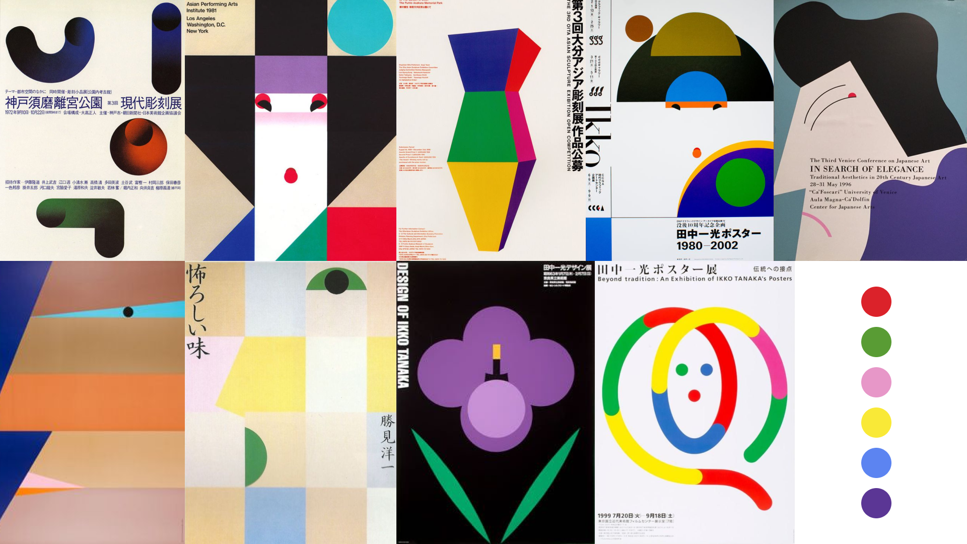
What I discovered
Inspired by traditional Japanese arts like Rinpa painting, Ikko Tanaka's designs simplify objects into basic geometric shapes, emphasizing simplicity and clarity. His vibrant color use blends the old and new, particularly in his renowned poster designs for Noh performances and exhibits.
Ideation
Sketching
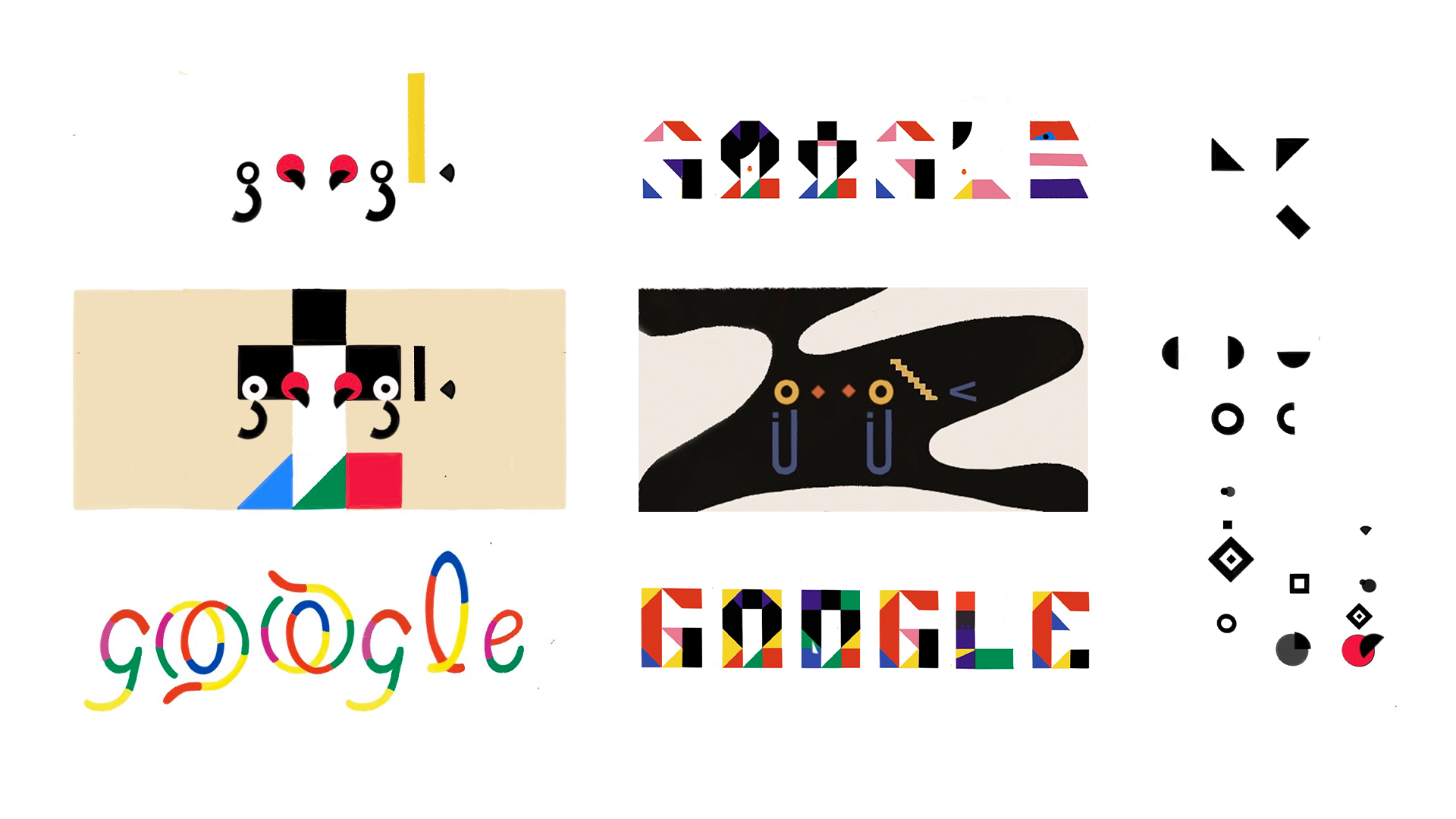
Concepts were created using geometric shapes and a limited colour palette observed in Ikko Tanaka's works.
Design
Black and White Process
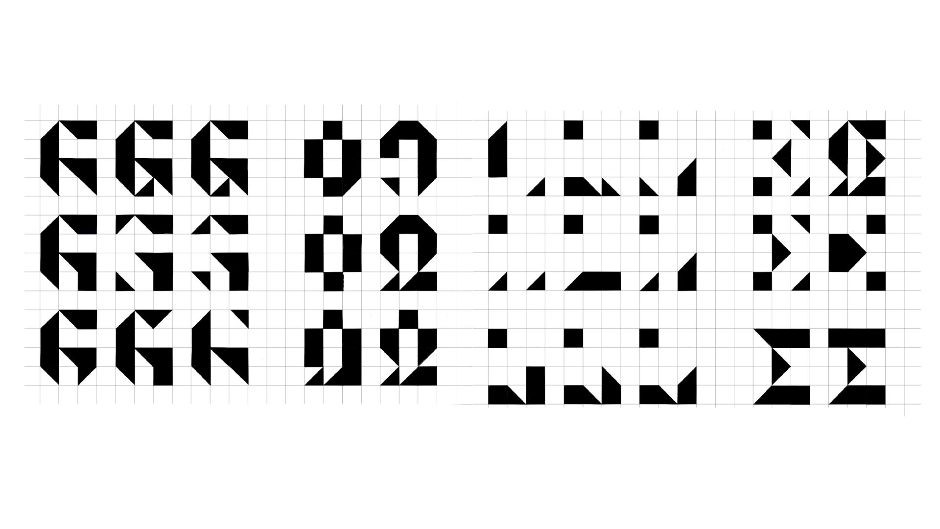
The design was created in black and white to emphasize the form and balance of the letters.
Colour Process
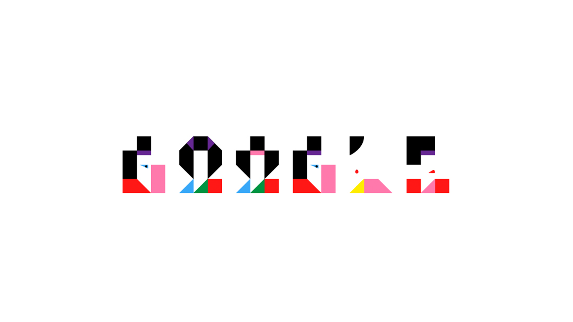
Limited color schemes were used to create an association with the use of color in Ikko Tanaka's works.

Design Iteration
The saturation of the warm colours (red, pink, and yellow) was increased to create more balance with the bright cool colours (blue, green, and purple).
Storyboarding
We created a seven-step storyboard layout based on the chosen concept. This storyboard illustrates the key geometric shapes moving on a 3x3 grid until they reach their designated spaces, thereby forming a letter.
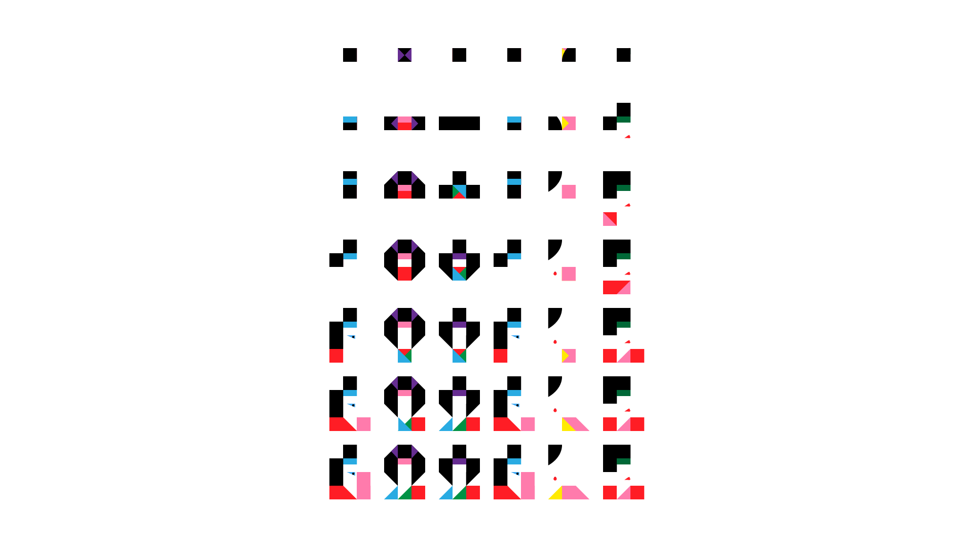
Final Design

Reflection
Final Thoughts
This project was an enjoyable learning experience that introduced me to new storytelling techniques like animation to enhance visual design. Furthermore, it gave me the opportunity to delve deeper into Ikko Tanaka's works and experiment with letters. It also inspired me to consider designing the remaining letters in the Latin alphabet in the future.
Key Takeaways
This approach helps you concentrate on the form and balance of the design. Make animations that mirror the design to enhance its narrative. If a colour scheme seems too muted, mix it with a vibrant colour scheme to add liveliness.
What I’d improve
Make the visual design interactive for the end user. For example, when the user hovers over the logo, the animation should loop. Also, consider experimenting with the lettering to create additional forms.